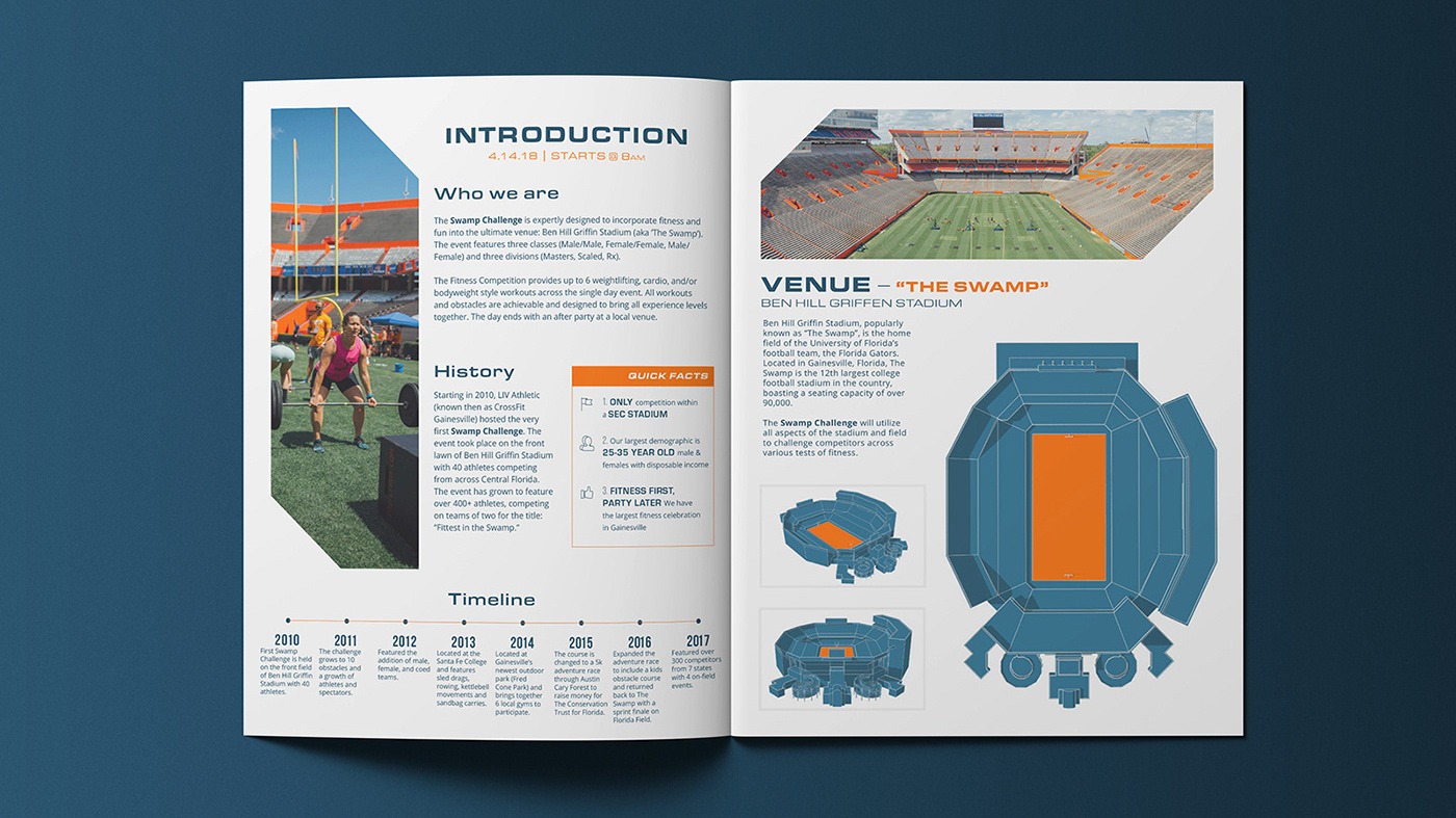
Nannies of the North is a nanny agency based in central Minnesota. The focus was to create an identity that could simultaneously work with both adults and children, but also embodied a Midwest aesthetic.
The icon was built to embody a bridge of sorts that combines multiple minimal elements. The foundation is a house that continues to a tree. The middle section (called out by a secondary color) represents Nannies of the North; as a bridge between the family and the nanny.
Photography
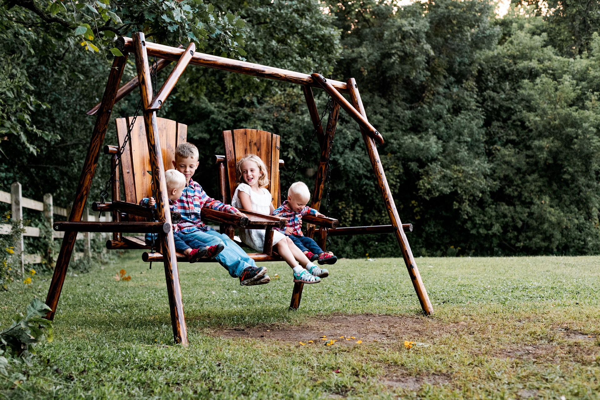
To launch the brand, we put together a quick photo shoot with a client that doubled as a nice set of family photos.


